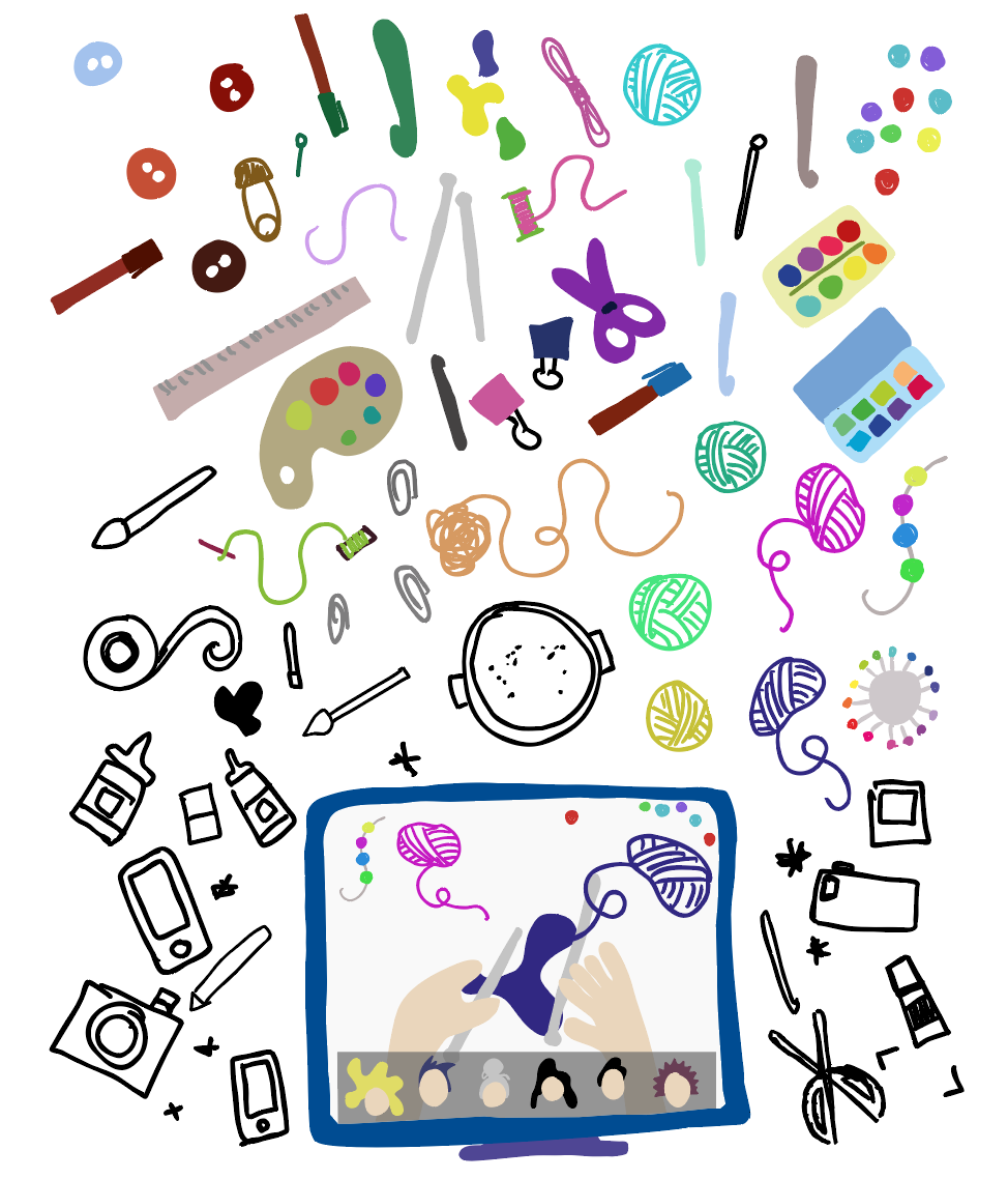
I have been developing the branding for a while now and need to start thinking about the assets that will be used. This will be for the website and pdf, as well as on the designed application as well. I started creating artwork last week to help me advertise and explain the monthly themes prior to there being any content created or live workshops filmed.
This was quite successful and I have developed some of these designs quite a lot since then. I have focused on adding colour to the craft items so they are more recognisable. This will definitely be useful in the long run for this project. I am quite happy with these hand drawn assets as it reflects the creative nature of BRIGHT and how we encourage rough and messy outcomes. We don’t expect everyone to be brilliant at all crafts, it’s meant to be fun.
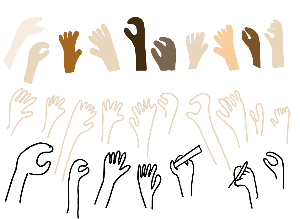
I have also added skin colour to the hand illustration that I have created. I ensured that we are inclusive to all colour types.
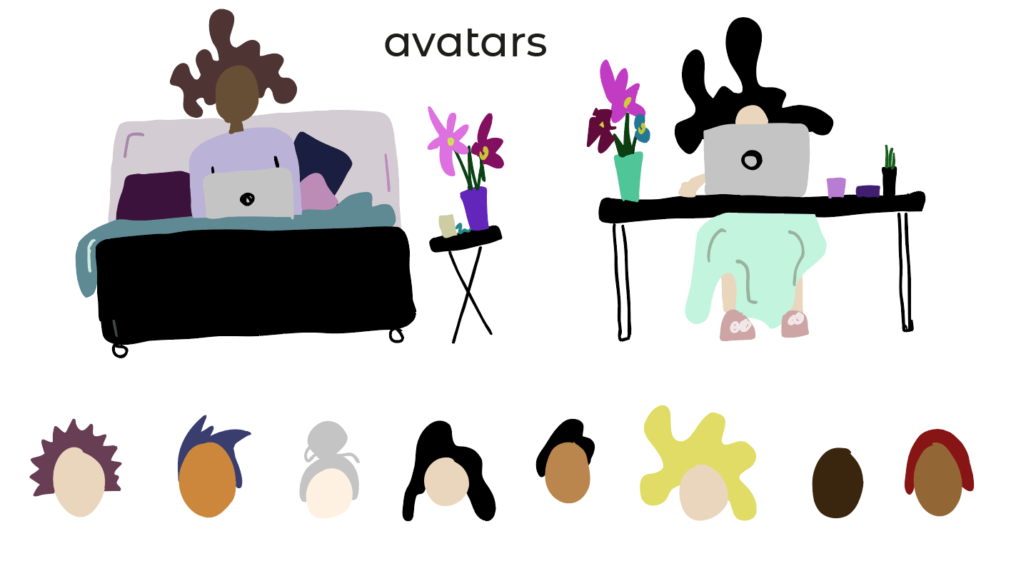
The same was considered when editing the avatars. This was really important as I don’t want to use imagery other than for sharing creative activities. Which meant not including profile photos. By removing this option, we are encouraging people to be less judgemental, and focus on only the creativity. So to do this, we need to ensure people can be unique with their avatar. I haven’t fully designed the options yet, but they will follow suit to the style of avatars bellow. With options to change hair style and colour as well as skin colour. Keeping it as simple as possible.
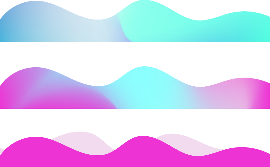
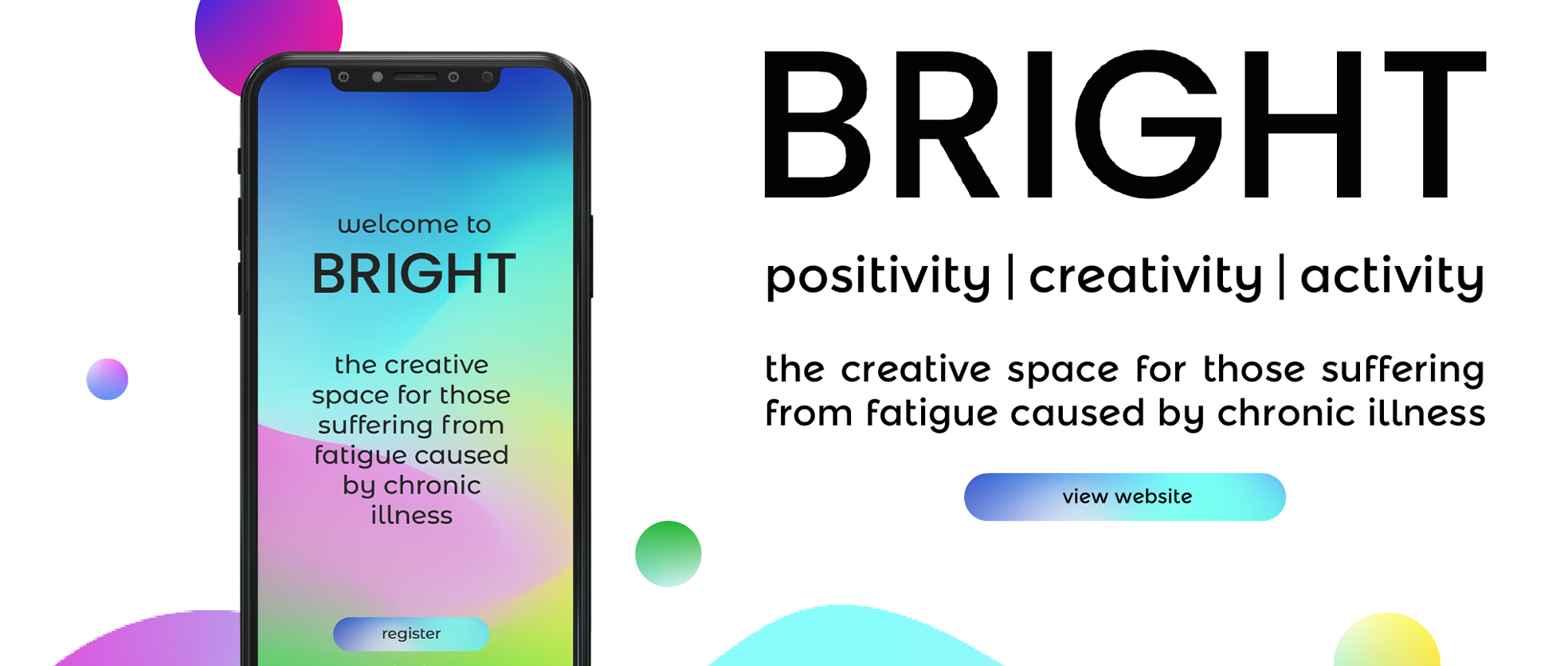
As well as avatars and creative assets, I have also started think about the shapes in which the gradients will be used in. I thought that waves and circles are very natural shapes, that help represent creative flow. These will need to be develops more but this will definitely help me in presenting my final brand guidelines.
