Navigation Bar
Now I need to begin designing the interface design. I have tried out a few variations, but what I want to do is keep the gradient themes to match up with the three pillars, positivity, activity, and creativity.
The cleanest way of doing this I found was having the page you are on highlighted with its correlating gradient, as seen bellow. This may change down the line but for now I am happy with how this might work.


Interface Background
Starting to recreate the wireframes with imagery, I started working with the background. Pulling in the correlating gradients for each section this initial mock up shows how this might work. It initially looks good, but may not work with the legibility of the text. I will see how I get on but I may need to make the background opacity.
If I get the time I would also like to make some moving images of the gradients to use for these backgrounds which might be very interesting.


Imagery & Content
I need some imagery to fill in the workshop videos here and the posts. To visually see how the app would work I need to create my own content to display this. I was inspired by my previous project from Module 3: Shop, where I produced the product “Desk View”. This gadget allowed you to make video recording or live stream creative tasks that you are taking part in. This is something that definitely would coincide with BRIGHT.
I used this product to create some new imagery and videos to help put together my final mockups of my application.


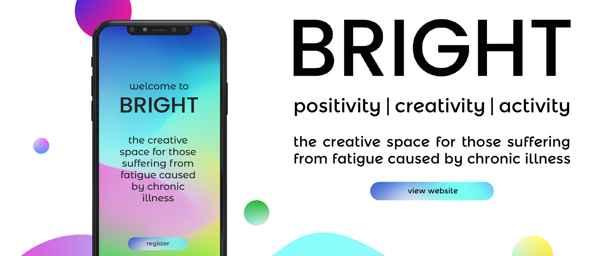
Journal
The welcome page is where you will land when you have installed the application and you need to register or sign into the account.
This is a very simple page but one that will be viewed by everyone. This keeps the branding and explains what the app is all in one place.

Positivity
This interface is the home feed and once you have signed in this will be where you land.
So far with the content in place I am definitely starting to like the look of how the imagery works with the design and the correlating background.
This is far from a perfected design with a lot of small ideas coming to me when designing this. Such as how would you follow people? How could you browse certain tags? Can you hashtag? These features might work under the search button but there is so much to consider when designing an application.

Activity
This page was a bit more difficult as I was starting to play around with the tabs. The wireframe for this was quite simple but even then when I was trying to come up with how this might look there are a lot of options. I wanted to focus on the tabs being white then the tab you are on to match the background. Similarly to the icons on the navigation bar.
Also, the featured image for this was quite difficult as I want the text to stand out but this image could be very busy. Playing with opacity, the size of the text and the colour may help to keep this text legible. I might come back to this to improve.

Creativity
This page is for displaying archived and upcoming live workshops. With this in mind, these featured images may be very busy and colours might be clashing. To see how this turned out has made me quite happy as it isn’t as busy and messy as I thought it was going to look.


Outcome
Overall these interfaces have work much better than I imagined. I am really pleased that I have been able to visually create how I picture the app to be displayed. There are quite a few things that I would like to improve on looking back. With one of the key things being the journal and the profile which at the moment are under one tab. This may have been better suited as two separate tabs entirely. Although that is more of a wireframe issue that an interface one it has been bugging me as I design the navigation bar.
The interface itself looks to achieve what I was with its creativity, due to its colourful nature and playful soft curved design and typography. I had a bit of a debate with myself with the background as I was worried that some of the text may not be legible, as well as it possibly distracting from the imagery content. This is why I may every try making some moving gradients to work as background imagery.