Brand Identity
Brand Name
I have now developed this idea for a community that will take the form of a platform as well as other forms. I now have to come up with a name that reflects the meaning and ethos of the brand. It will need to reflect: strength, creativity, positivity. The name is key here also as I envision it being the key driver for the brand.
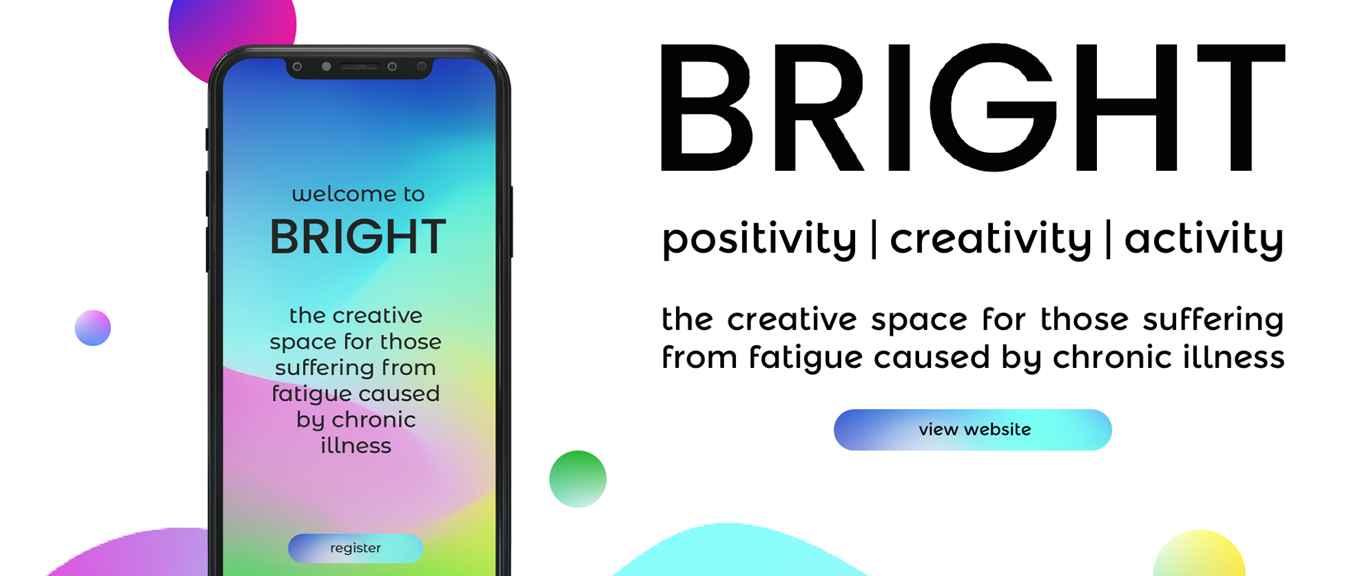
After a lot of brainstorming and letting the ideas settle for a few days. I found that BRIGHT represented the idea quite well. It expresses hope, positivity, as well as creativity and colour. Bright also reflects a clear mind and as well as having some creative connotations.

Brand Tagline
- Creative self-care
- Creativity for Fatigue
- Positivity. Creativity. Activity.
- Creative Community
- Creative space
positivity | creativity | activity
The creative space for those suffering from fatigue caused by chronic illness
Website Domain
I want the name of the platform to be really short and catchy. However, the word BRIGHT is unsurprisingly overused. I need to bring in words that will help people to understand what it is. The domain name for the platform was my basis for this as I need the socials to keep in line with the URL. So I started hunting for a domain that worked for what I am doing.
After a long time searching for one that ended with ‘.com’, (as I want this to be seen as a global platform). I found the following worked best.
brightcreativespace.com / brightcreativespace.co.uk

Brand Desig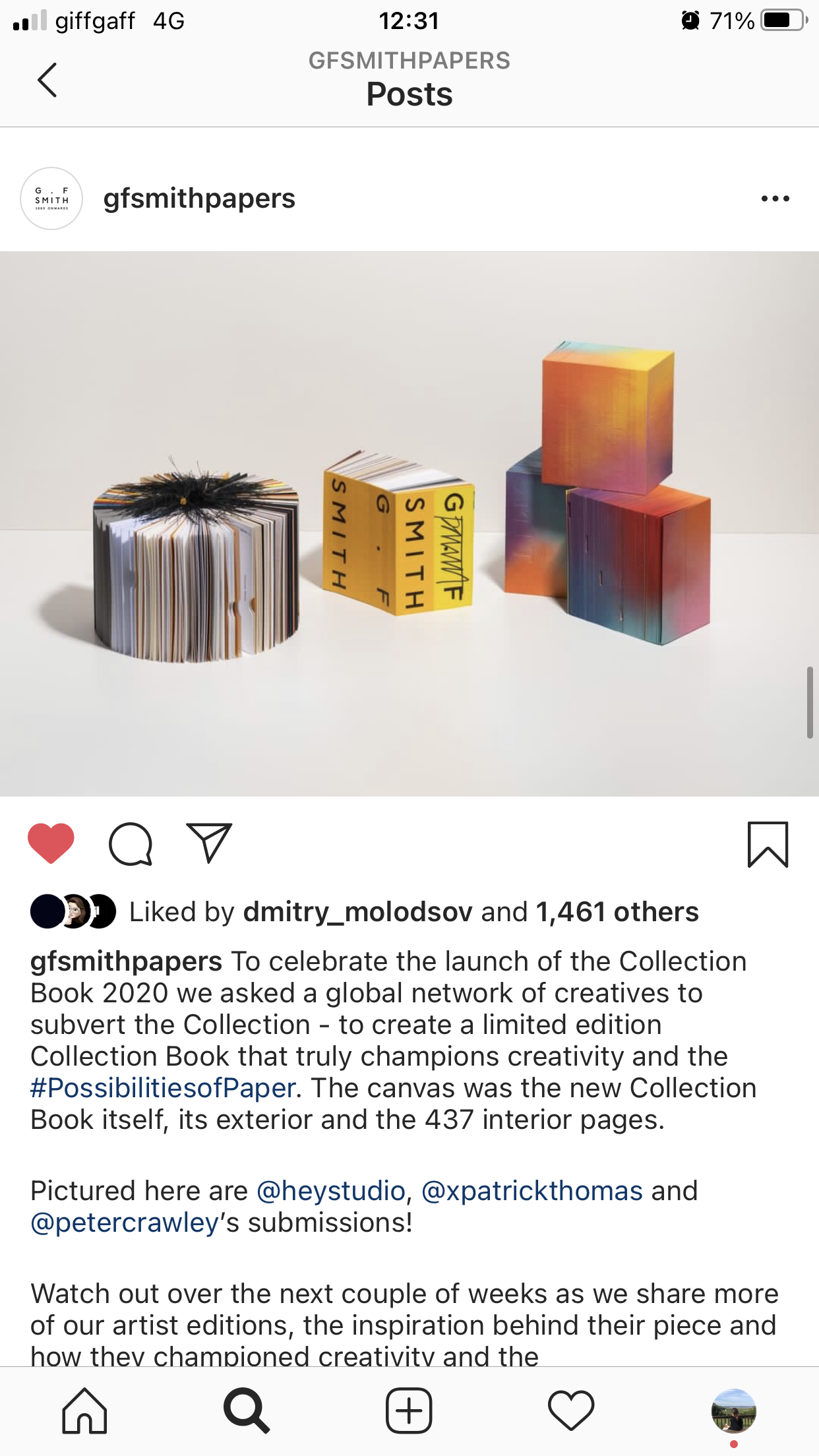 n
n
I am trying to look for some examples of a brand or project that works to create its brand from a community of people or multiple artists. The new GFS collection book was also a good example of this.. being sent and ‘vandalised’ by artists to create artwork out of the book. Brands that are changed by its users or by another factor.
Examples:
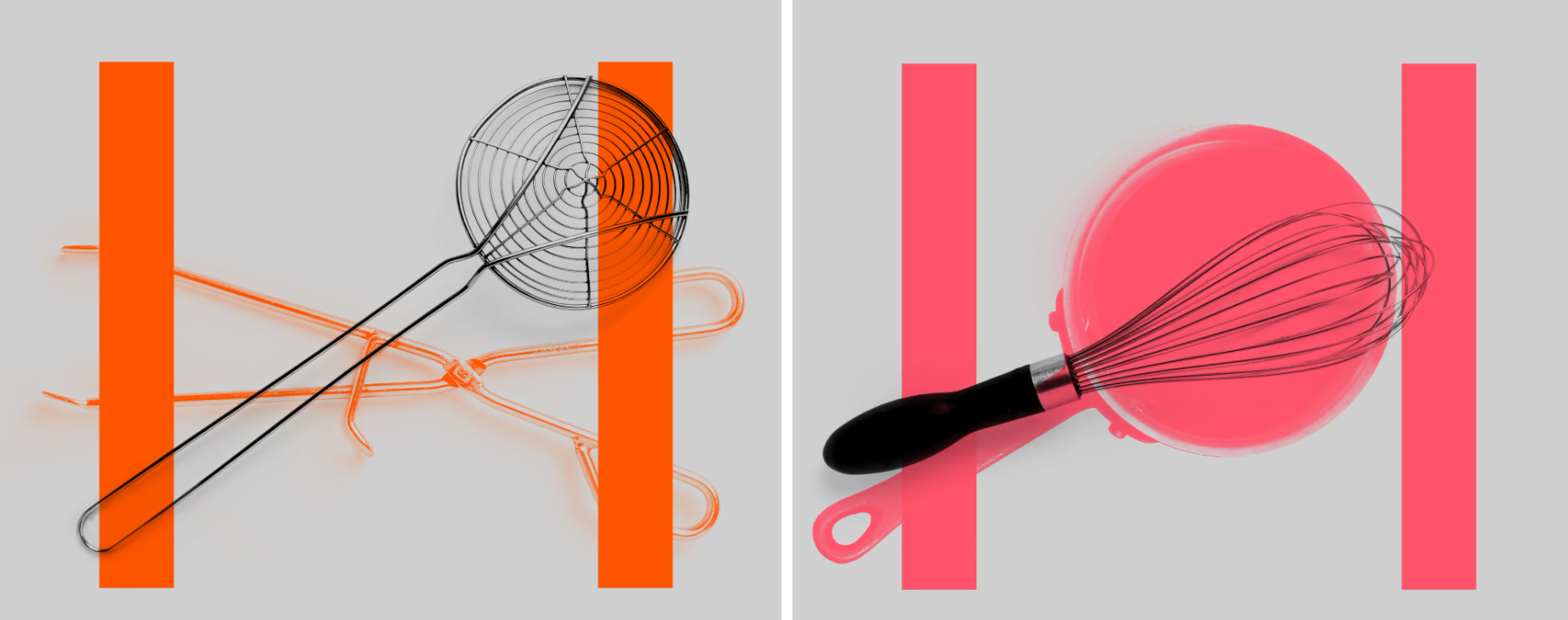
Spin Studio project for ‘Hatched’, a restaurant in Clapham Junction. This brand identity concept uses the horizontal line in ‘H’ to be created by objects. Realising if they put anything between the two lines they form the letter. This creative concept is something that has inspired my project massively.
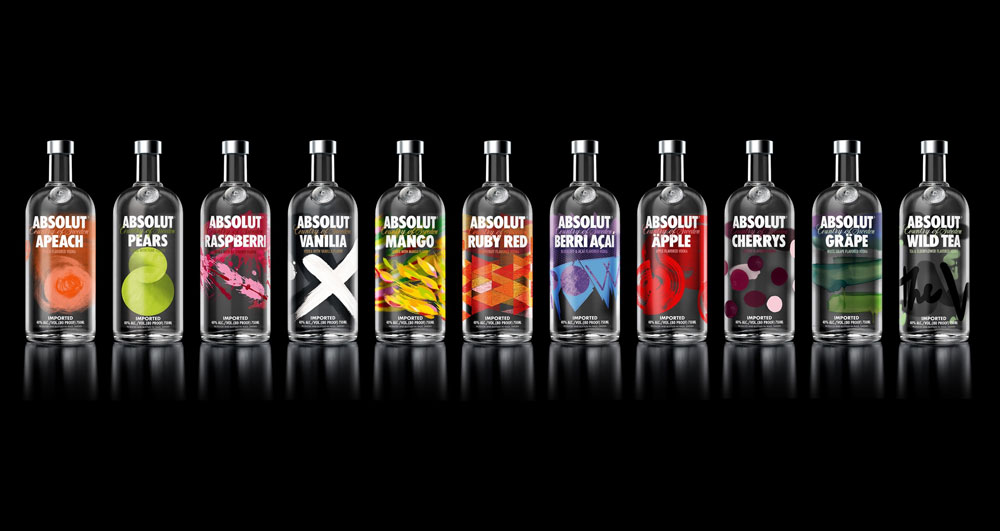
Absolute Vodka has a brand which is simply the name. The difference in their flavours are illustrated by their patterns surrounding their branding.
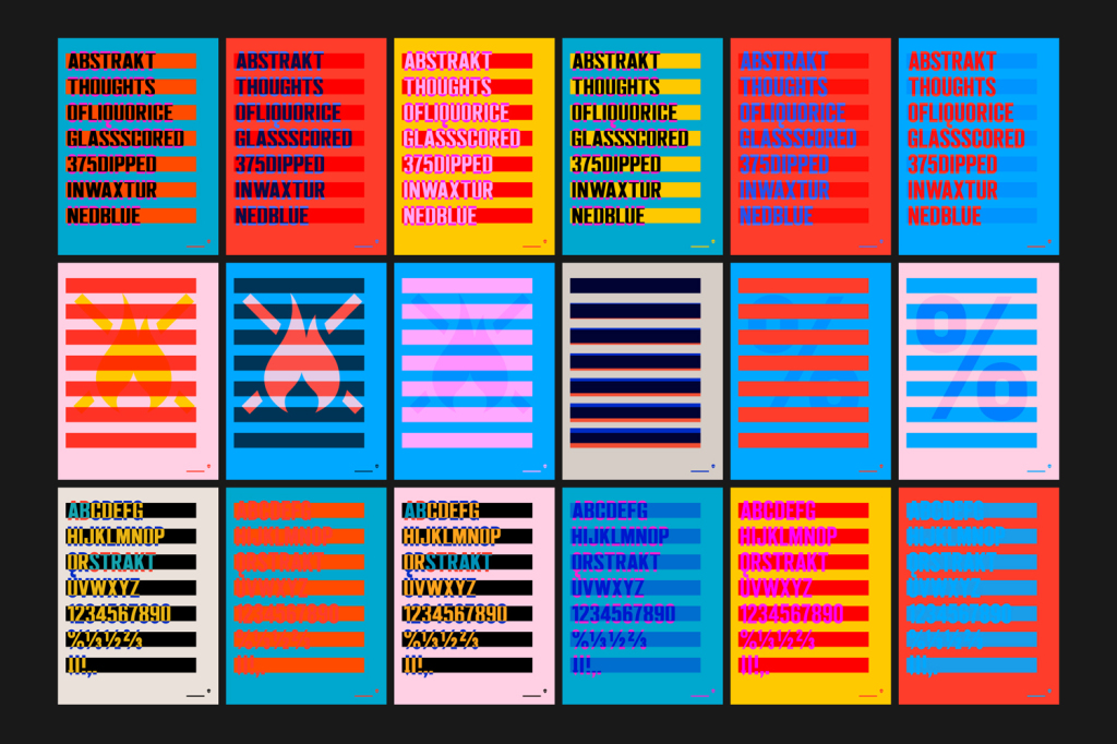
Brewdog Abstrakt project by O Street created a bold minimalist brand concept that stand out for its clarity and uniqueness. The colour, shape, and typography working together is something I want to depict through my project.
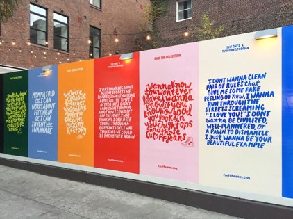
Timothy Goodman is one designers example of what I want to achieve with sharing quotes or stories in a framed format.

Sharing different quotes relating to the three pillars of my project ‘positivity, creativity, activity’. I could use both colour and typography to illustrate the three separately. Similarly to how it has be done in the many examples I have gathered in the collage above.

Colour is key for my project as I want to use the power it has to our mental wellbeing. To select a single colour range is very difficult for me here. This is something I will have to come back to on deciding. However, the bright colours I have selected above will help me during my experimentation process.
Experimentation
I am starting to get some ideas for this project but I really need to start making things. As it is all about creativity and keeping busy with making things, that’s really what I need to start doing.
I have started by experimenting with the chosen name for the project, BRIGHT. With the possible idea of having the branding be many different variations of the name created in different creative formats.

The outcome for this was quite successful. Not because of the outcomes itself but to get going with the creativity of the project. It allowed me to come up with some fresh ideas.

Mainly inspired by the ‘SPIN’ Studio website. I want to create branding that is simplistic, so it can work with the many create outcomes that this project will have. I experimented with a number of different letterforms and arrangements. I found that although I really do like creative and unique letterforms, it doesn’t suit what I am trying to achieve.

H1 – Poppins
This bold, clean, simple font works for what I wanted with my branding. Keeping it minimalistic in style to pair nicely with creative and colourful imagery.

Body & Subheadings – Montserrat Alternates
For the body and subheading I chose to go with this font that has a slight twist to the classic clean Montserrat. As the heading is quite simplistic, I believed that this body text allowed for a slightly alternative font. With it being such a clean and rounded sans serif it is legible enough to be both a body and subheading typeface.

Now it was time to start thinking about the platform. As this would allow me to start making a structure for my brand to work from. The platform will allow me to develop my brand visually. I started by looking at a range of different sites and what headers I really liked the look of. Above were just a handful of what stood out for me.

I started making arrangements of the styles I like the look off to base my platform deign off once I started building the site.


I started experimenting with social frames with bold colours and stand out typefaces in the style of Timothy Goodmans work. Although they weren’t terrible, I just wasn’t working for me. The bold colours and the different fonts were not achieving anything.

These experiments weren’t great but also showed me what I did want to do. Focus more on the colour. Going back to where i want analysing what colour scheme I wanted, I don’t believe one colour was enough. This is where I started thinking about gradients and possibly even moving image. Creating flowing colour schemes.

Looking at different gradient and videos, I thought I could start building my brand with these. As I start creating some visuals with these I will see if they will work or not and from there make some further developments as I go. For now though, I really need to create some visuals to work with.

This is the initial look of my logo and favicon. I am really happy with this compared to the initial social frames. As the gradient of multiple and changing colours also represent the many different forms the creative field can take. Whether that music, sculpture, painting, drawing, craft.

Website Experimentatio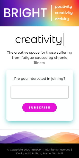 n
n
I started putting these initial ideas all together on my platform. The typefaces, coloured gradients and the layout inspired by some research of other sites.
This brand is really starting to take shape. Although there is still a long way to go I am really how I have initially developed this branding.